Flow’s mission is to create low-carbon communities of the future that enhance livability, reduce costs and are self-sufficient.

Flow Systems builds local utilities for communities to sustain their own water and energy needs. Sustainability is core to what they do. They provide recycled water and develop agile energy for electricity, heating and cooling to greenfield and urban infill communities.

“By recycling water, we bring life-giving abundance to people’s everyday lives in a way that’s innovative and responsible.”
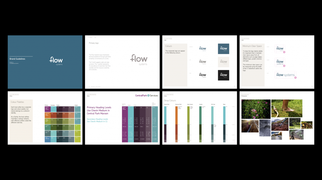
When I started at Digital Eskimo the Flow Brand and logomark (designed by Benjamin Hoh) had already been well established in the marketplace. In the background, Flow was rapidly expanding requiring more assets, more variations, and had just been backed by global asset management leader – Brookfield Infrastructure. This meant the brand needed a massive audit. I was tasked with refining the brand guidelines, assets, and architecture as well as usage for several smaller child identities.

Chevin was the selected brand typeface for its contemporary, humanist style whose shape and rounded terminals suggest pipes and natural flow. Chevin’s restrained shapes and simple construction mean it’s particularly suited to signage and small type.
Separate child identities are created for each new community where Flow provides its services. These local identities provide individual character while the Flow corporate brand runs throughout all the local identities with shared icons, types and colour palettes.
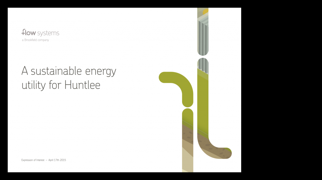
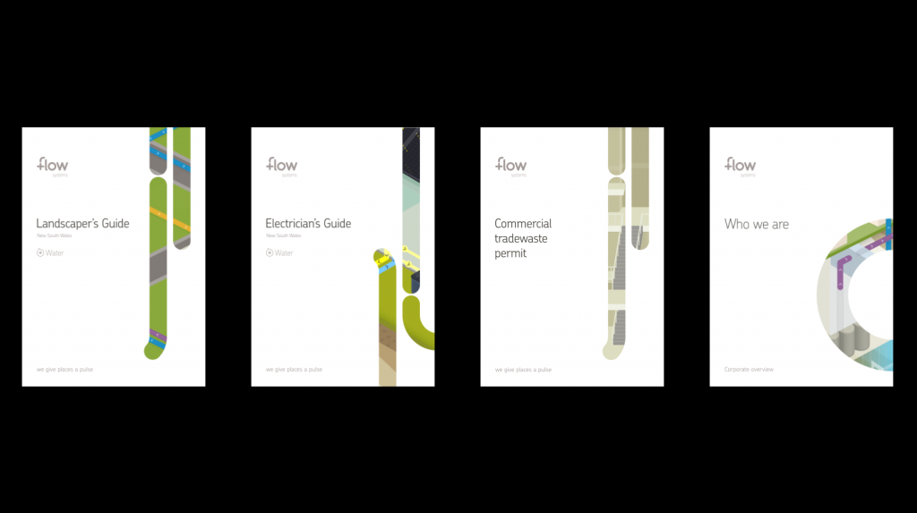
Diagrams are used to reflect Flow’s future community and technology visions. Their tone allows them to speak to both developers and customers in a human and relatable way. They visualise how processes and systems acquire, distribute and deliver resources around a community.